Astroknot
Branding, Brand Extraction
Client: Astroknot
Art Direction: Otto McDonald
Astroknot is the creative vision & directorial work enthusiastically projected onto the world by Otto McDonald. Based out of Atlanta, Otto is a true visionary artist that uses the world of film and video to transmit the stories he receives from the universe. Astroknot is also a beatsmith and rapper infusing funk, trap, and 90's bass music all with a forward thinking ATL mindset.
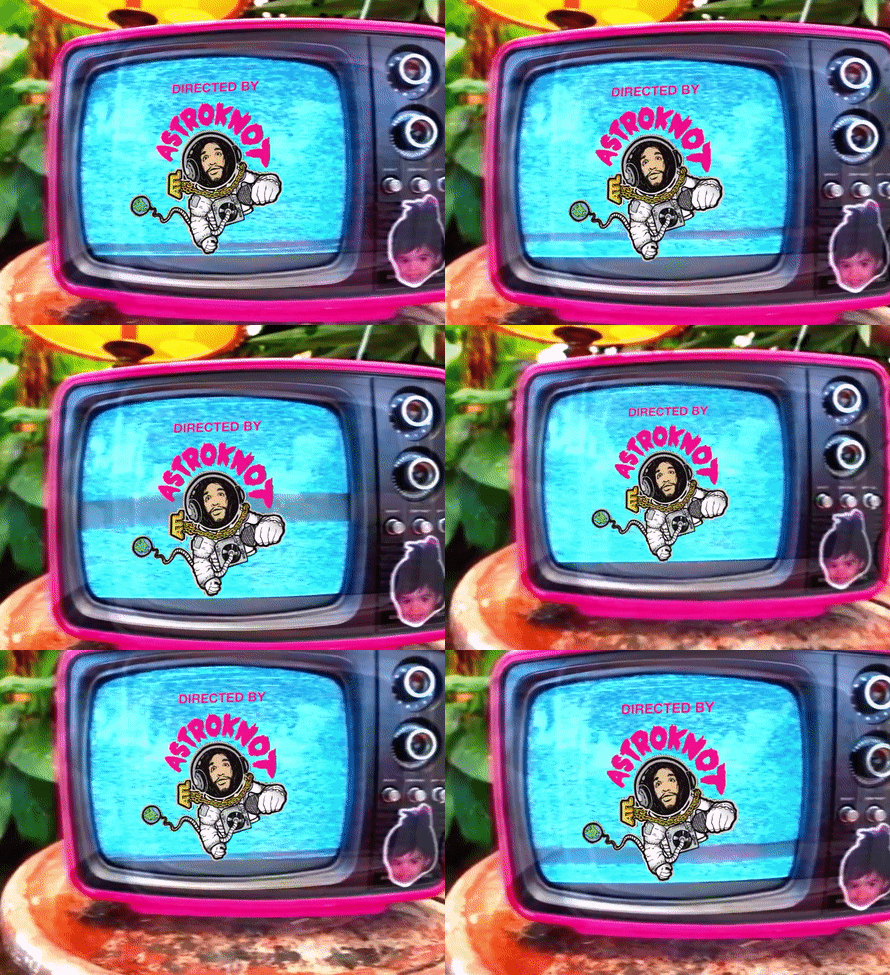
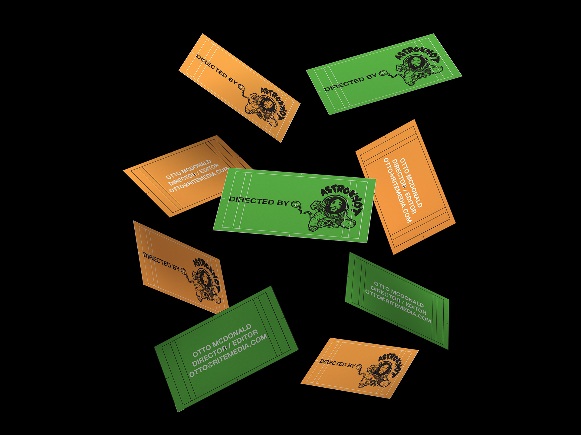
Otto came to me in search of a cohesive branding system to mark his music video directional work. He needed a mark to build his recognition as he transitioned from just a rapper & producer and into his new role as director & editor. We took some old sketches he had gathered from previous explorations and we worked together to add color to the illustration, tighten up some lettering, and ultimately extract the brandmark from his past creative ideas.
Otto came to me in search of a cohesive branding system to mark his music video directional work. He needed a mark to build his recognition as he transitioned from just a rapper & producer and into his new role as director & editor. We took some old sketches he had gathered from previous explorations and we worked together to add color to the illustration, tighten up some lettering, and ultimately extract the brandmark from his past creative ideas.
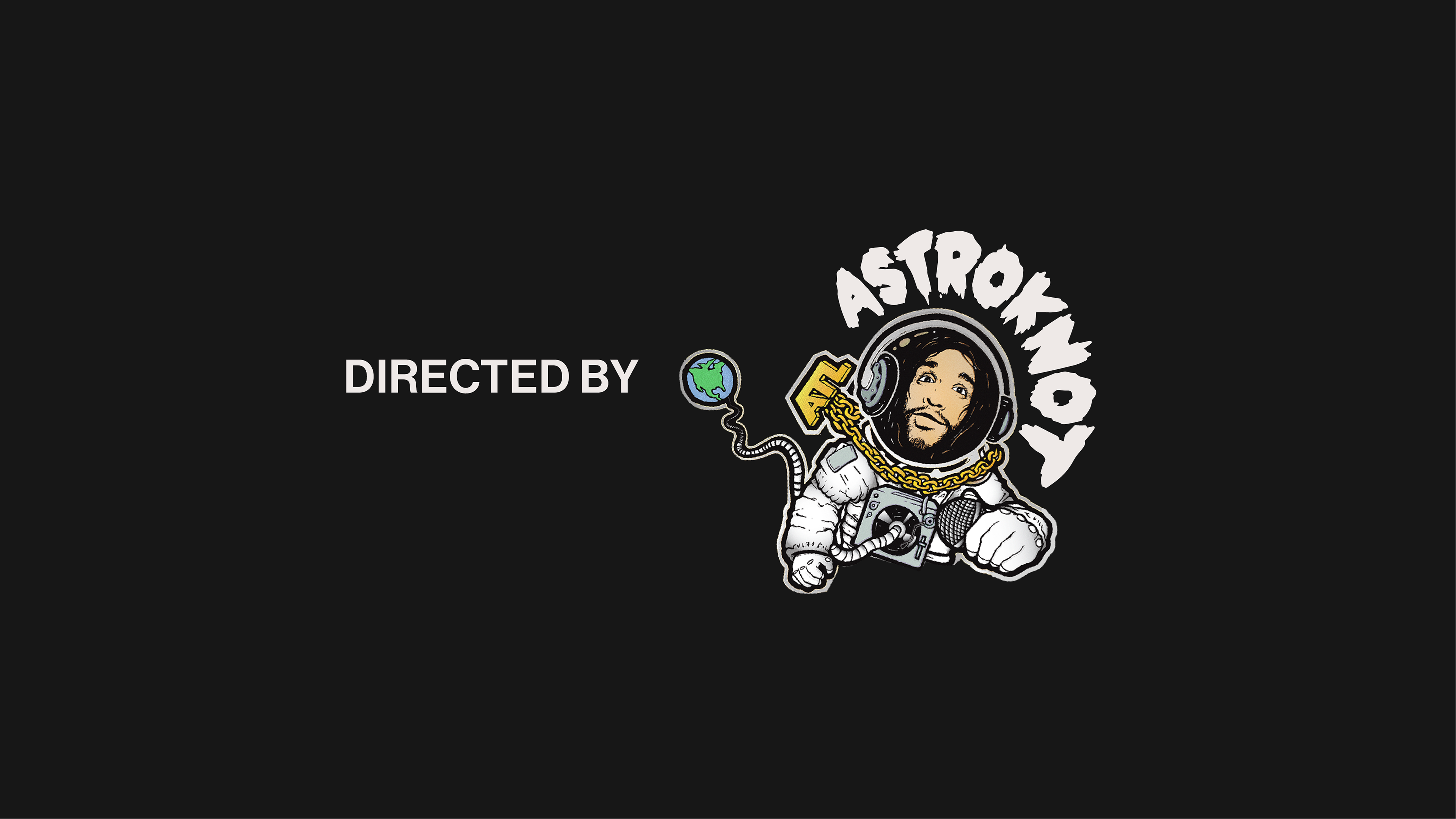
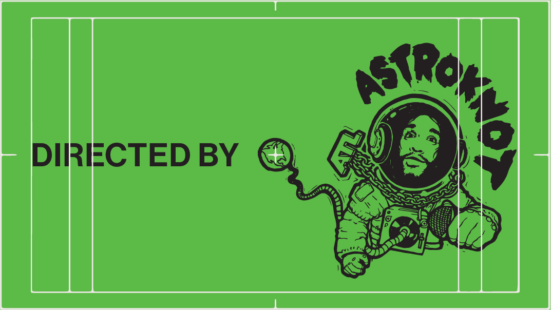
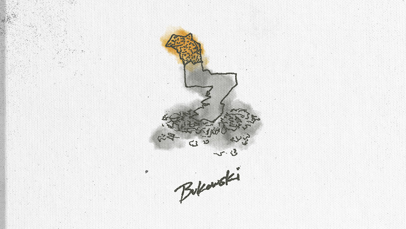
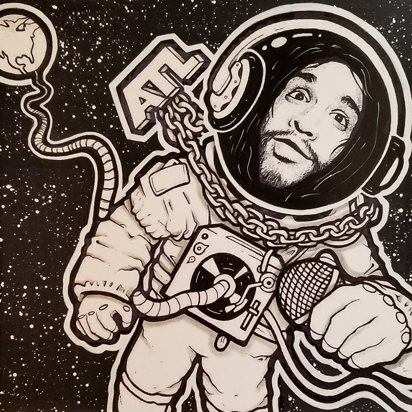
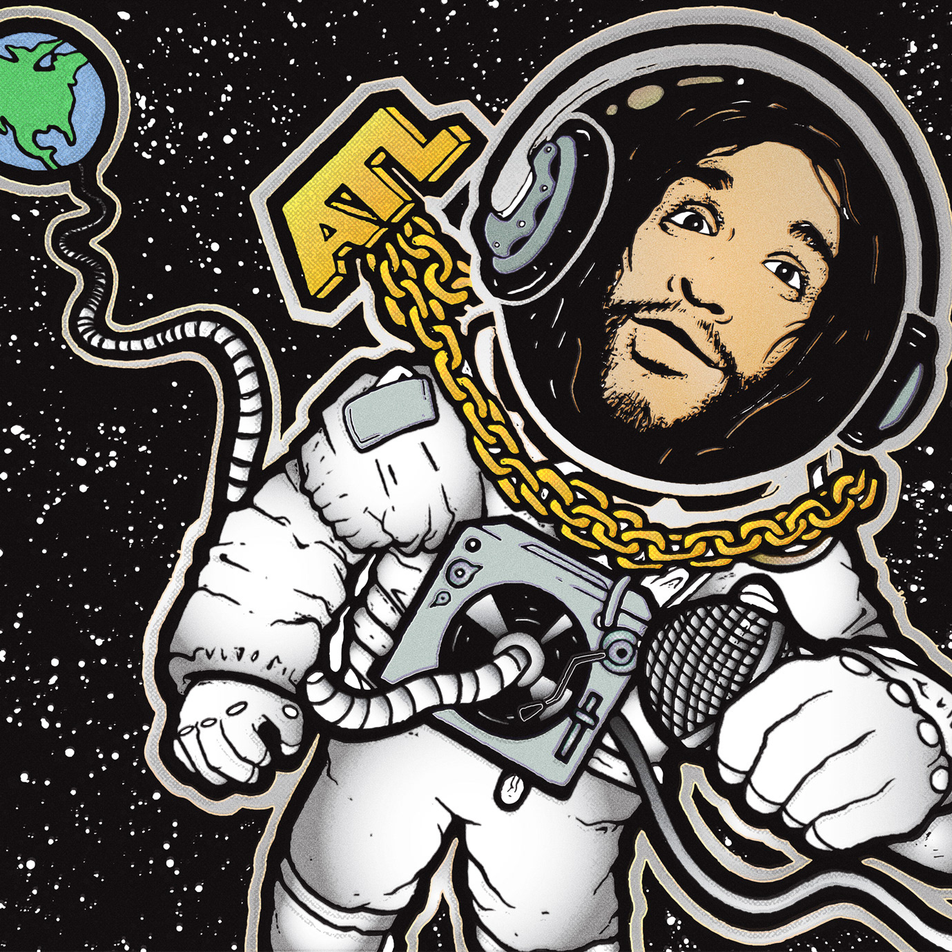
Otto provided a b&w drawing from his previous Astroknot album that he wanted to build off for the visual direction. From there, we colored the image and added both some texture and shading to add more depth.
Original illustration by @Tater_Shmater
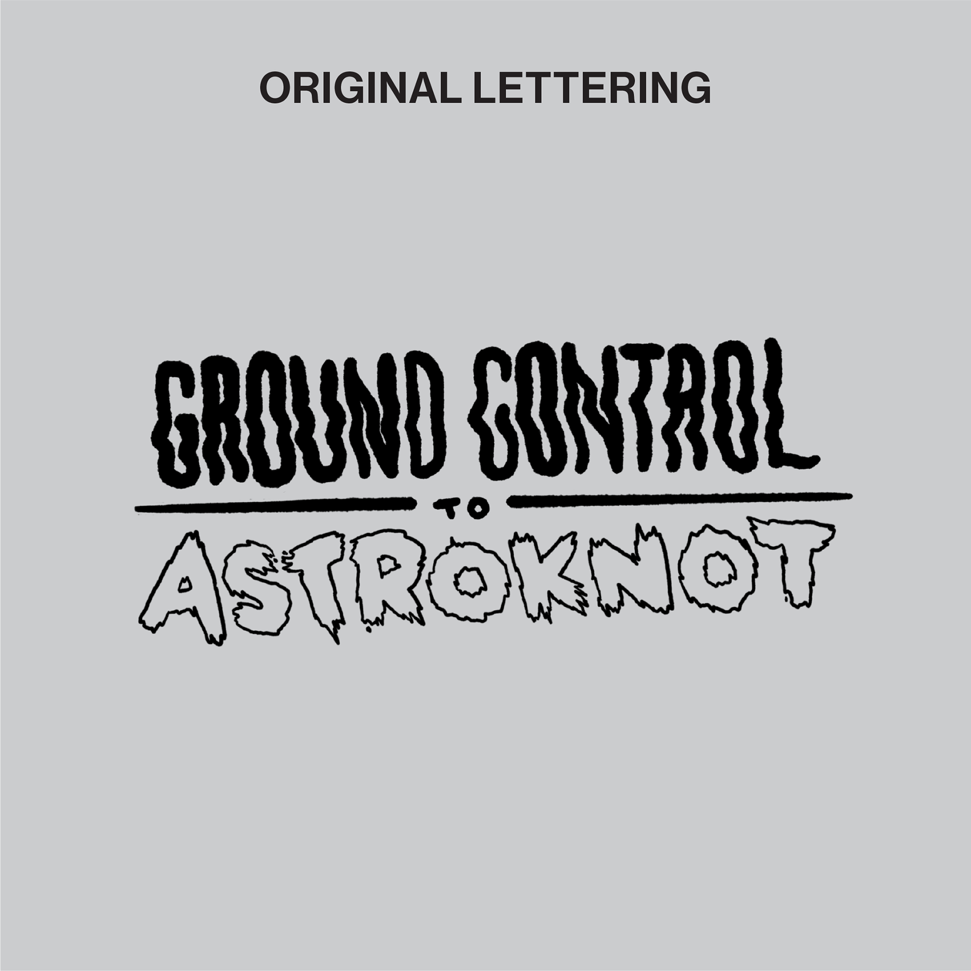
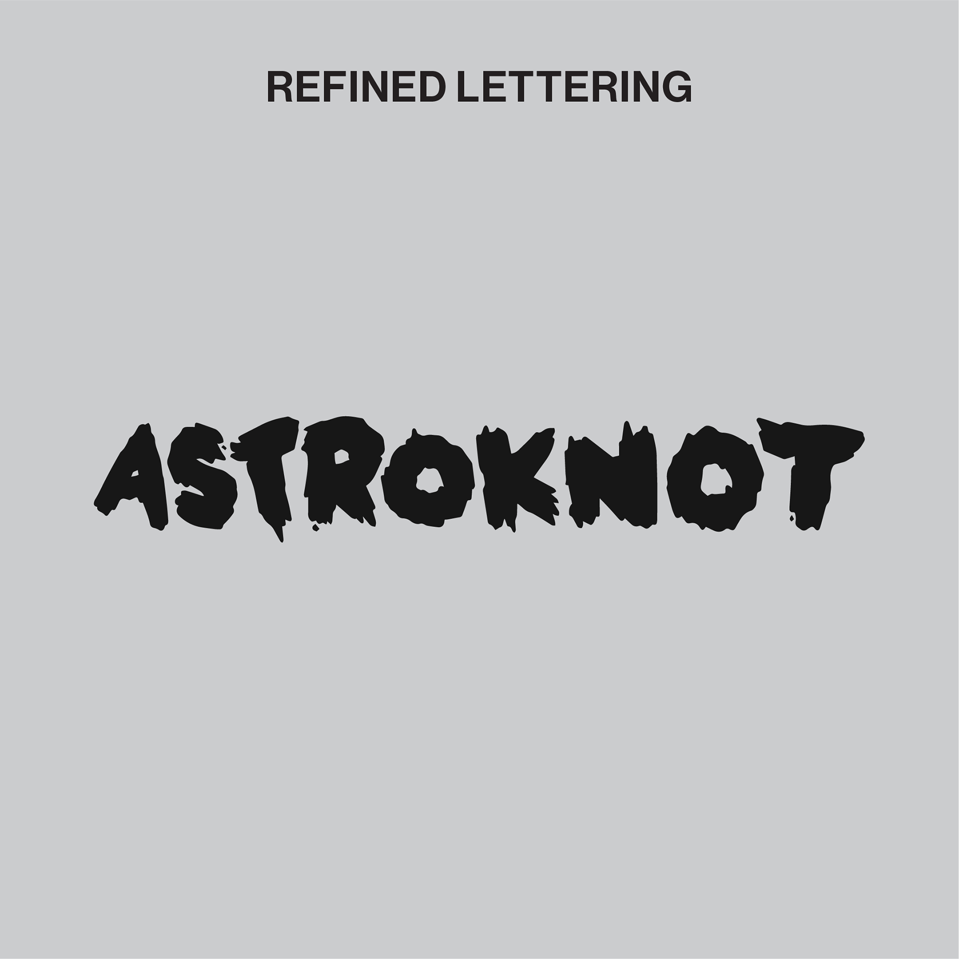
For his creative wordmark he also provided the initial phases of previous lettering explorations from the same album. We dropped the album title and focused in on the Astroknot lettering by removing the outlined approach and giving it a bolder look with filled-in letters. We also lightly softened the edging by rounding some points and balancing each character.
Original lettering by @Cateye
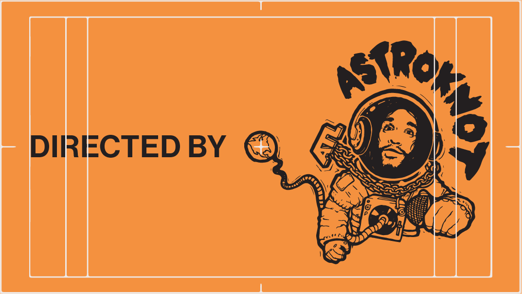
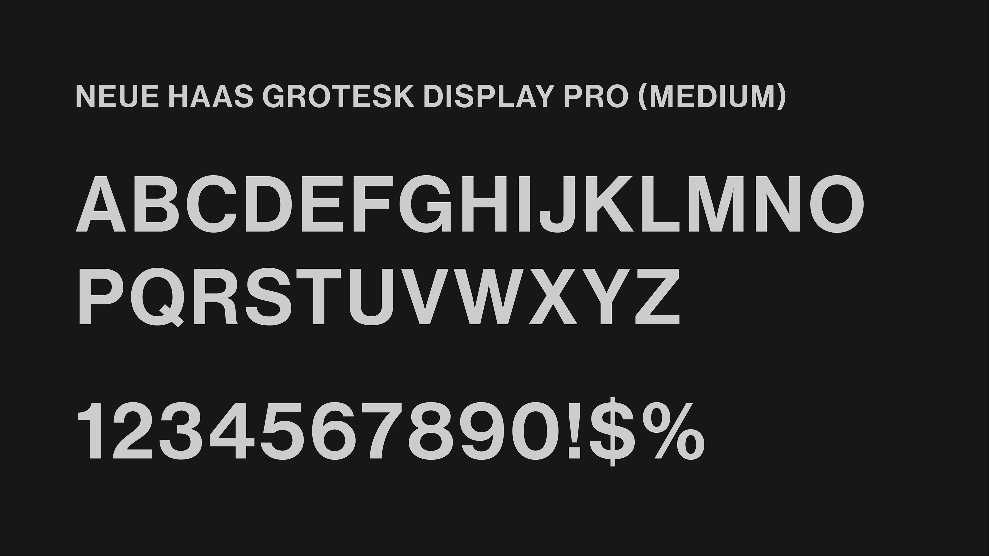
In order to keep the branding versatile we chose to use an available and easily accessible typeface. Neue Hass Grotesk is a bold, clean, and flexible typeface that can stretch across a multitude of environments without losing it's definition or taking any attention away from the brandmark, wordmark, or illustration cut-out.
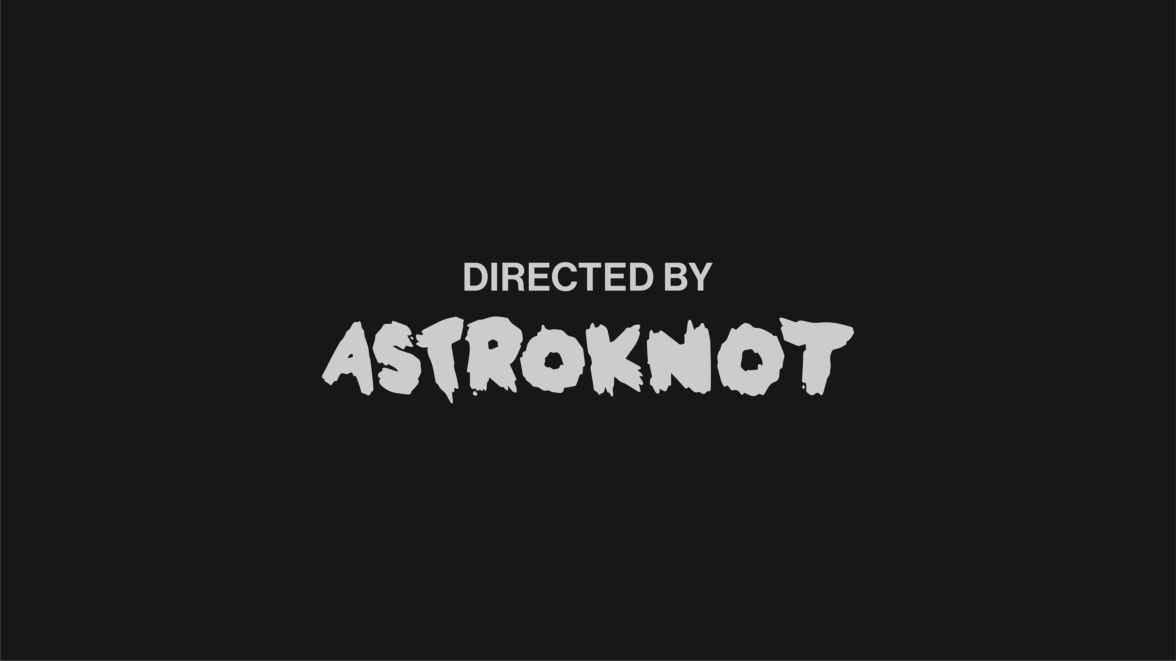
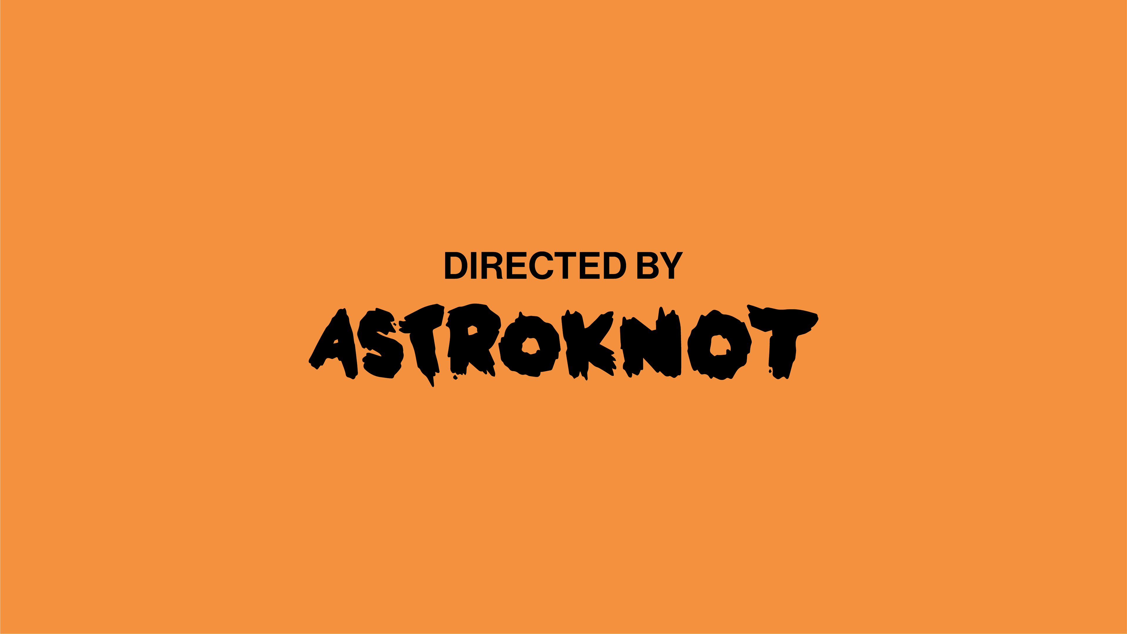
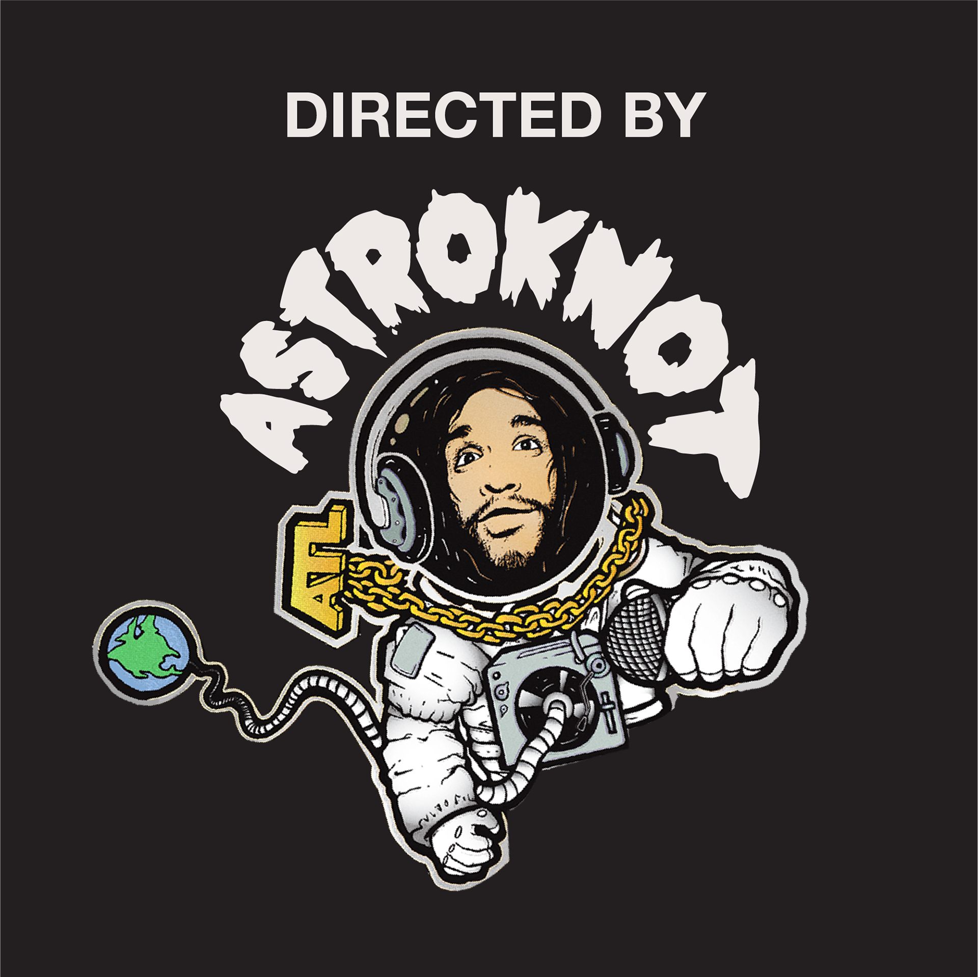
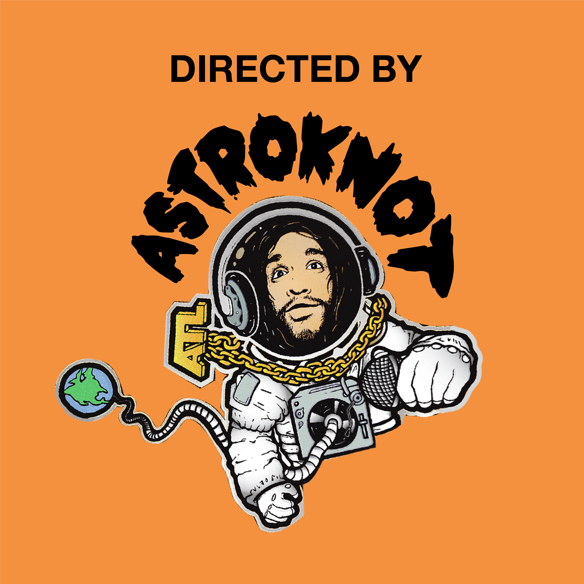
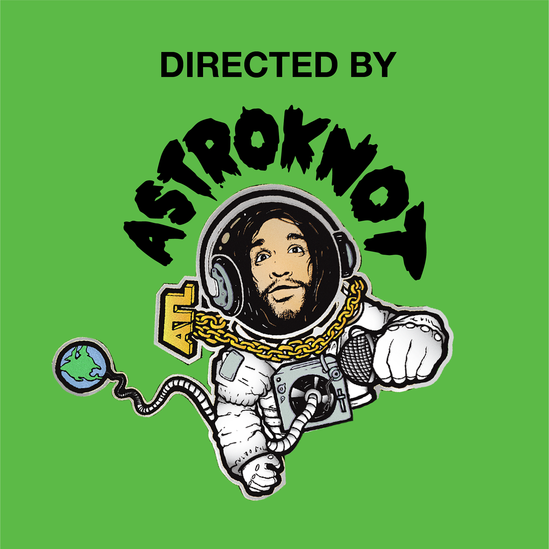
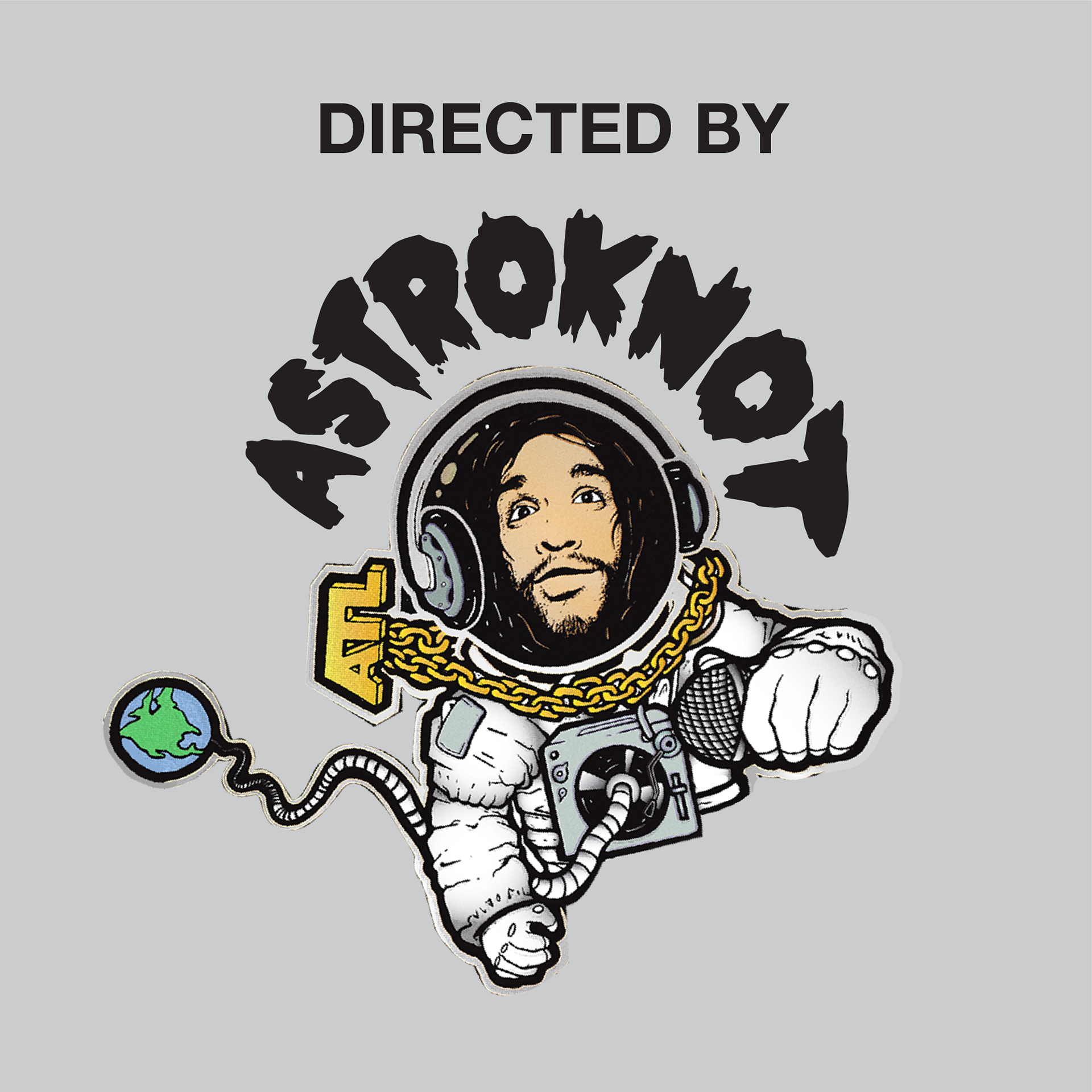
The lettering and type within the directors mark has flexibility. Based on the environmental elements within the music videos it can fluctuate with the direction of the video itself.
